Company
Hired is a two-sided marketplace connecting companies with tech talent. This project spanned both the Candidate team (responsible for the quality and quantity of candidates on the platform) and the Employer team (responsible for helping recruiters find top talent and schedule interviews).
Problem
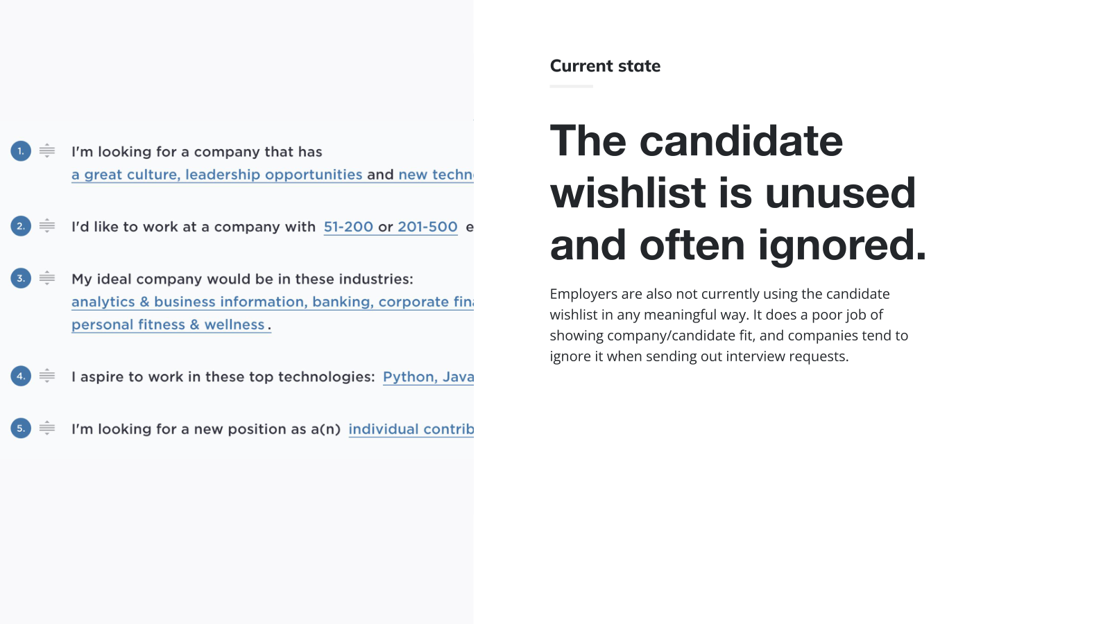
There was a poor company/candidate fit for the interview requests companies sent. The existing candidate wishlist was unused and ignored — employers didn't trust it as a signal, candidates didn't feel heard, and acceptance rates suffered as a result.
- Target users: engineers, PMs, designers, and data analysts on the candidate side; recruiters on the employer side.
- KPIs: interview acceptance rate, and the percentage of candidates receiving interview requests (IVRs).
Approach
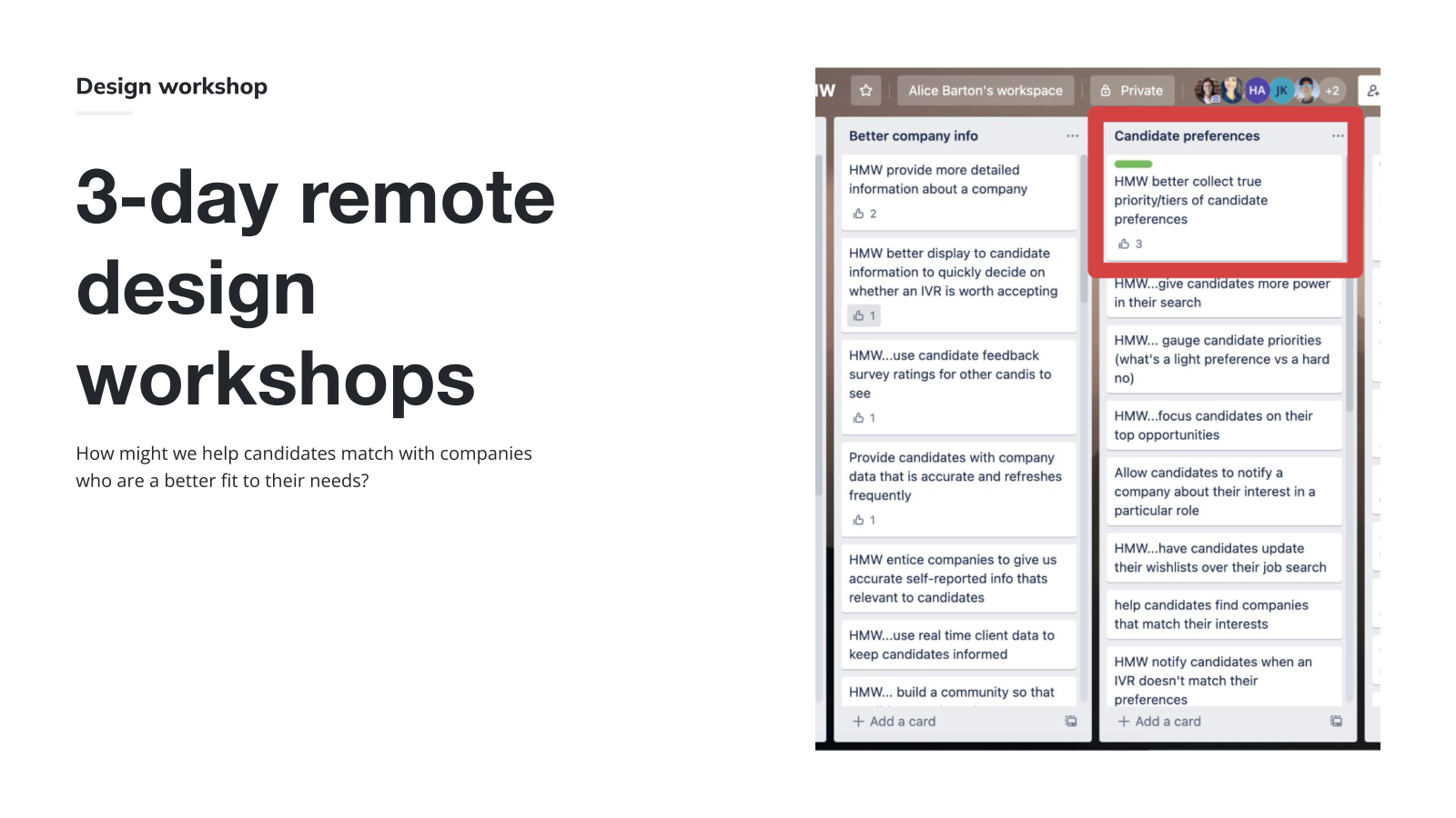
I ran a 3-day remote design sprint with members across design, engineering, product, sales, and candidate experience around the prompt: How might we help candidates match with companies who are a better fit to their needs?
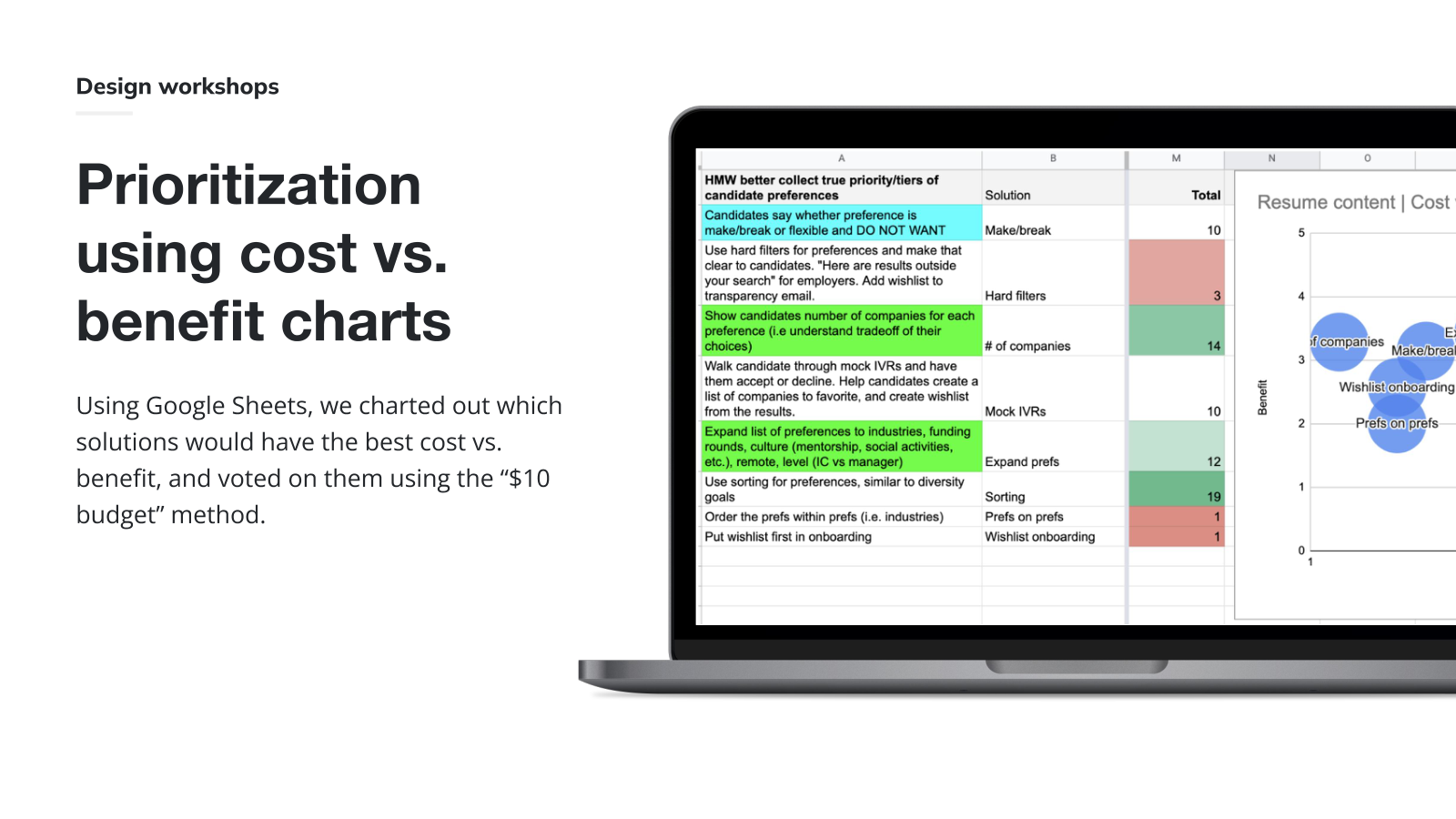
We prioritized solutions in a cost-vs.-benefit chart and voted on them with the "$10 budget" method to land on the bets worth prototyping.
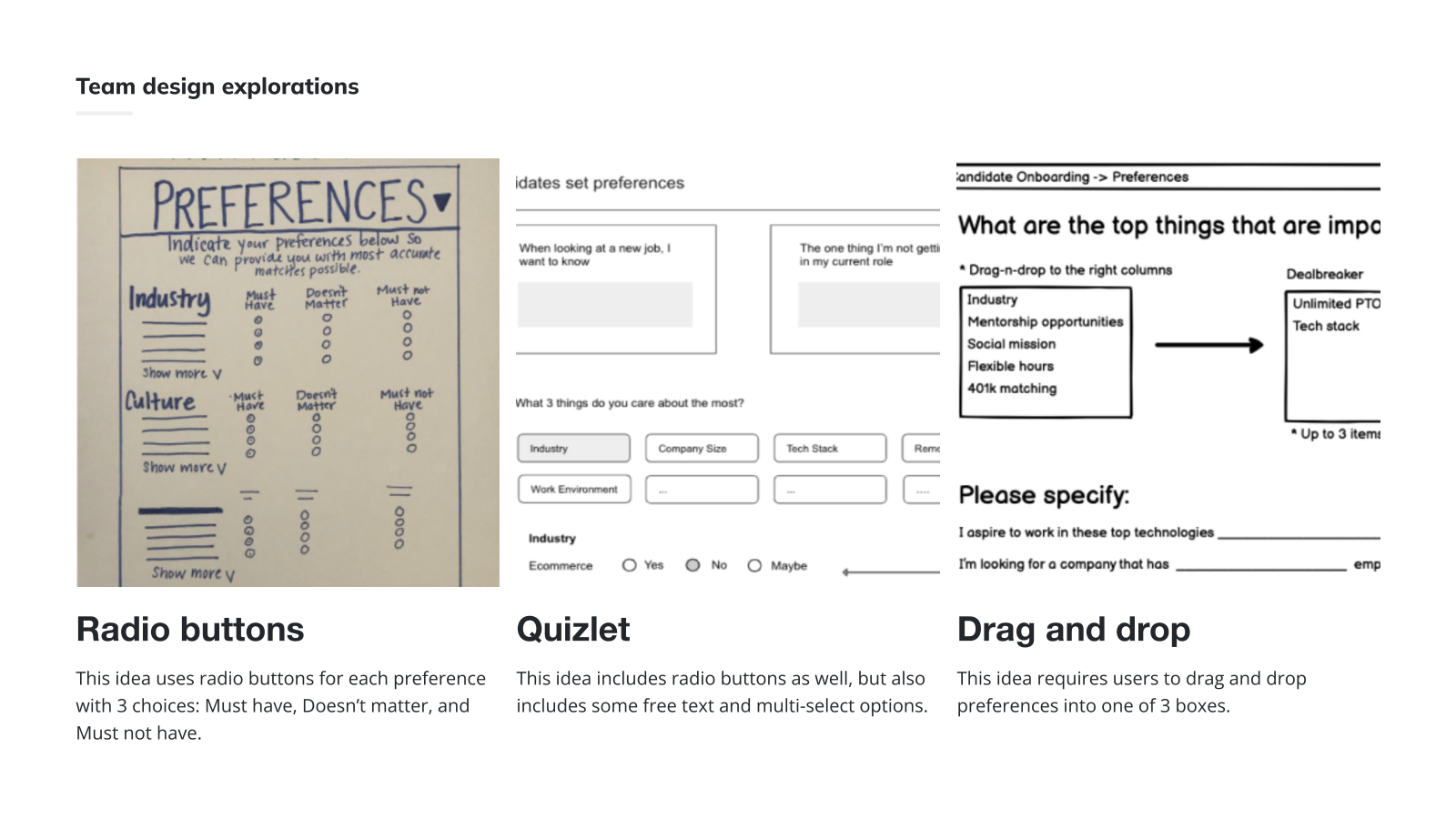
The team sketched three directions in parallel — radio buttons by category, a Quizlet-style mix of radios and free text, and a drag-and-drop into Must/Doesn't matter/Must not have buckets.
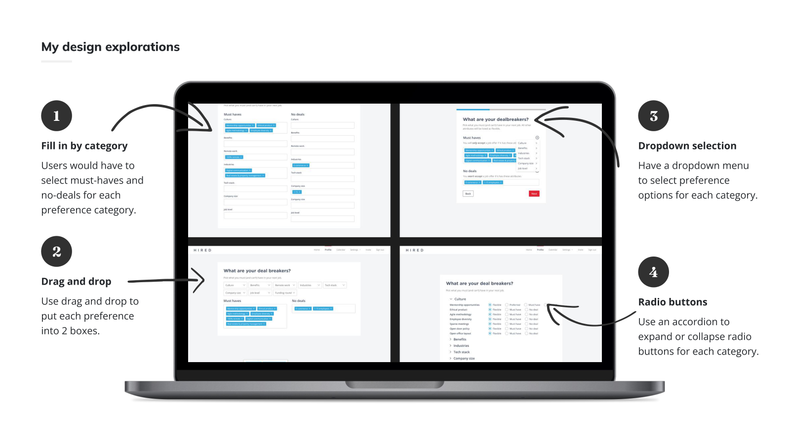
On my own I pushed four candidate-side directions further: fill-in-by-category, drag-and-drop, dropdown selection, and an accordion of radio buttons. I tested these internally and on usertesting.com to compare comprehension and completion.
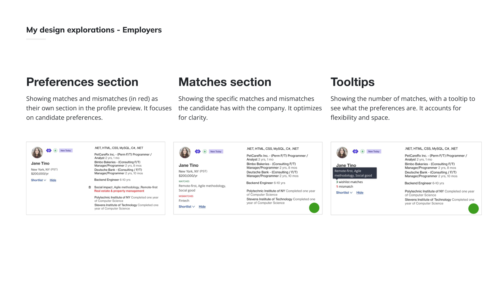
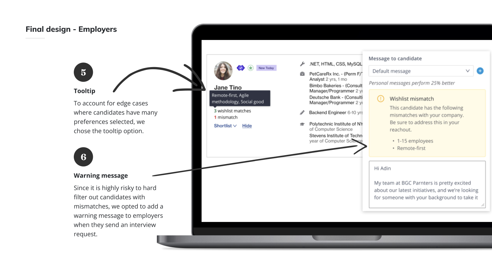
For the employer side, I prototyped three ways to surface match information on the candidate card: a dedicated preferences section, an explicit matches/mismatches section, and a compact tooltip. The tooltip won on space and edge cases — employer cards are dense and many candidates have long preference lists.
Solution
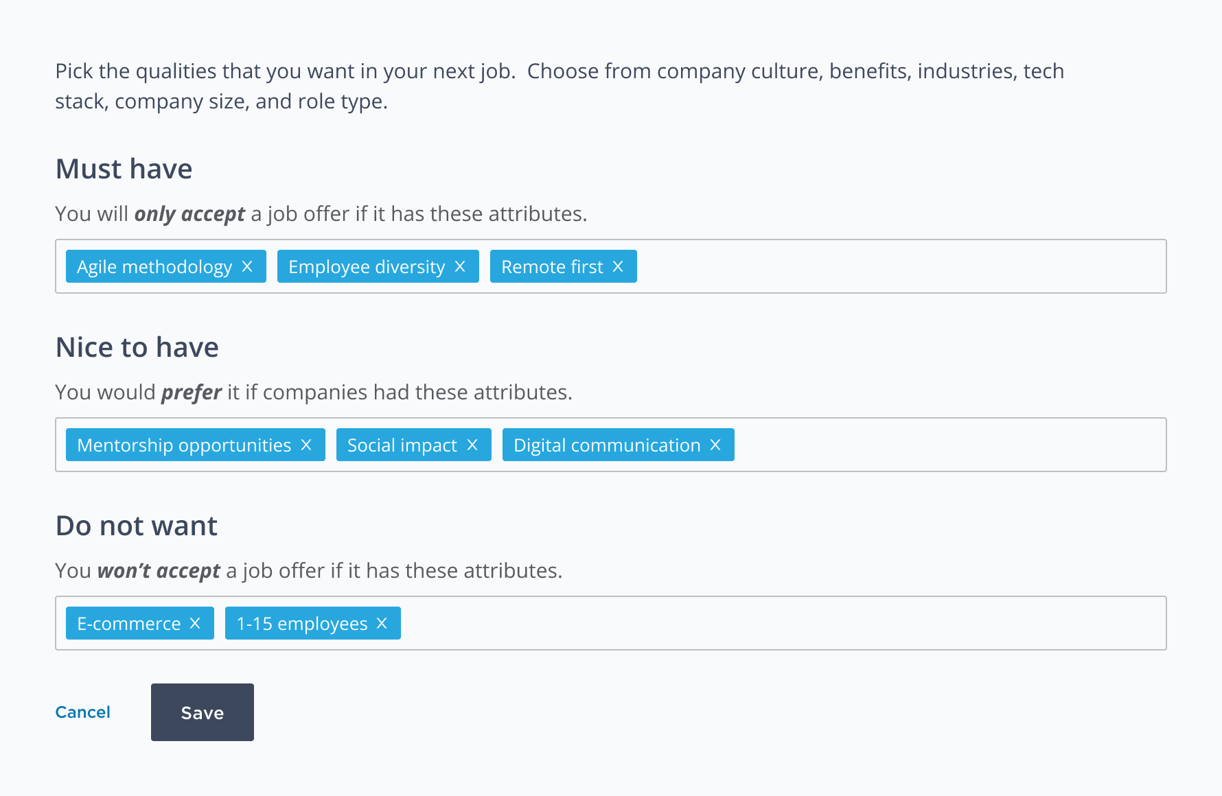
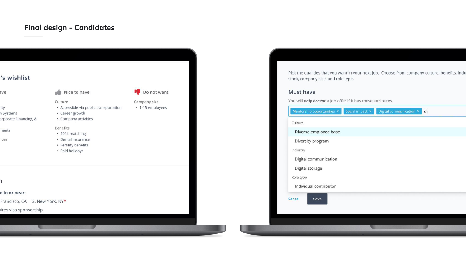
The final candidate experience replaces the old numbered list with three labelled buckets — Must have, Nice to have, and Do not want — and a categorized multi-select with type-ahead so candidates can quickly express tiered preferences.
On the employer side, mismatches appear in two places: a tooltip on the candidate card for at-a-glance scanning, and a warning banner inside the interview-request composer prompting recruiters to address mismatches in their reachout. We deliberately chose a soft warning over a hard filter — early data showed many candidates were willing to interview despite mismatches, and a hard filter would have removed real opportunities from both sides.
The result
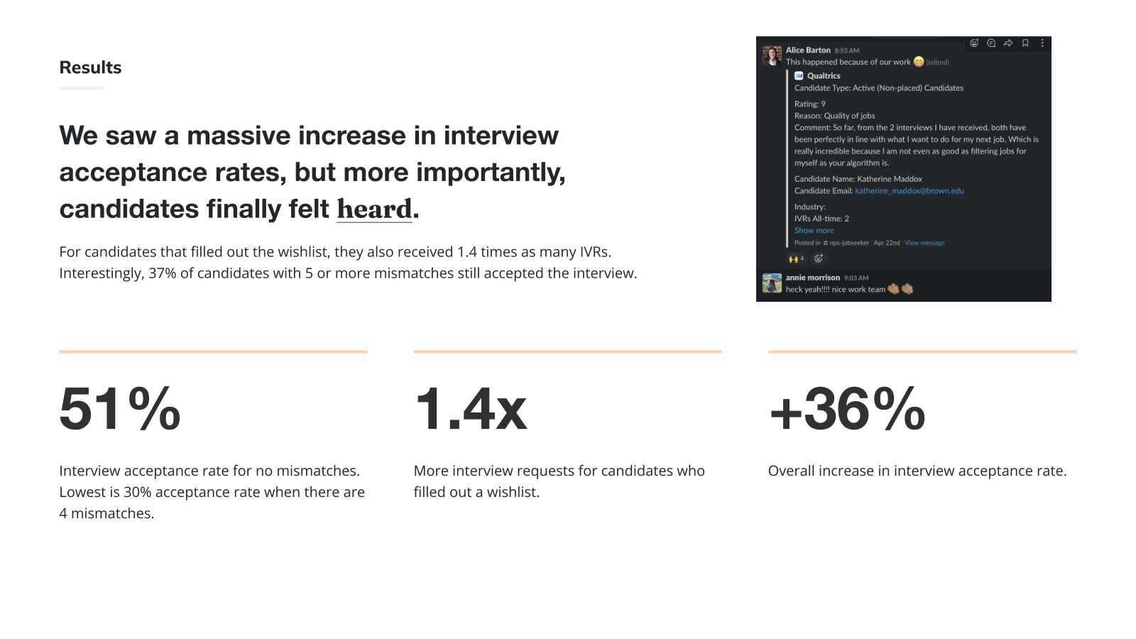
Acceptance climbed across the board: +36% interview acceptance rate, 1.4× more interview requests for candidates who filled out a wishlist, and 51% acceptance at zero mismatches (vs. 30% at four mismatches). Even at five-plus mismatches, 37% of candidates still accepted — which is exactly why the soft warning beat a hard filter.
What teammates said
"Alice delivered on every single one to huge success — e.g. increasing new user conversion 40%."
"I particularly enjoyed the fantastic Design Sprint that she ran for our Candidate Experience Strategy."